Bubble vs Text Box: Choosing a Type
NotifyBubble offers two notification types, each designed for different use cases. Understanding the differences will help you choose the right format for your message.
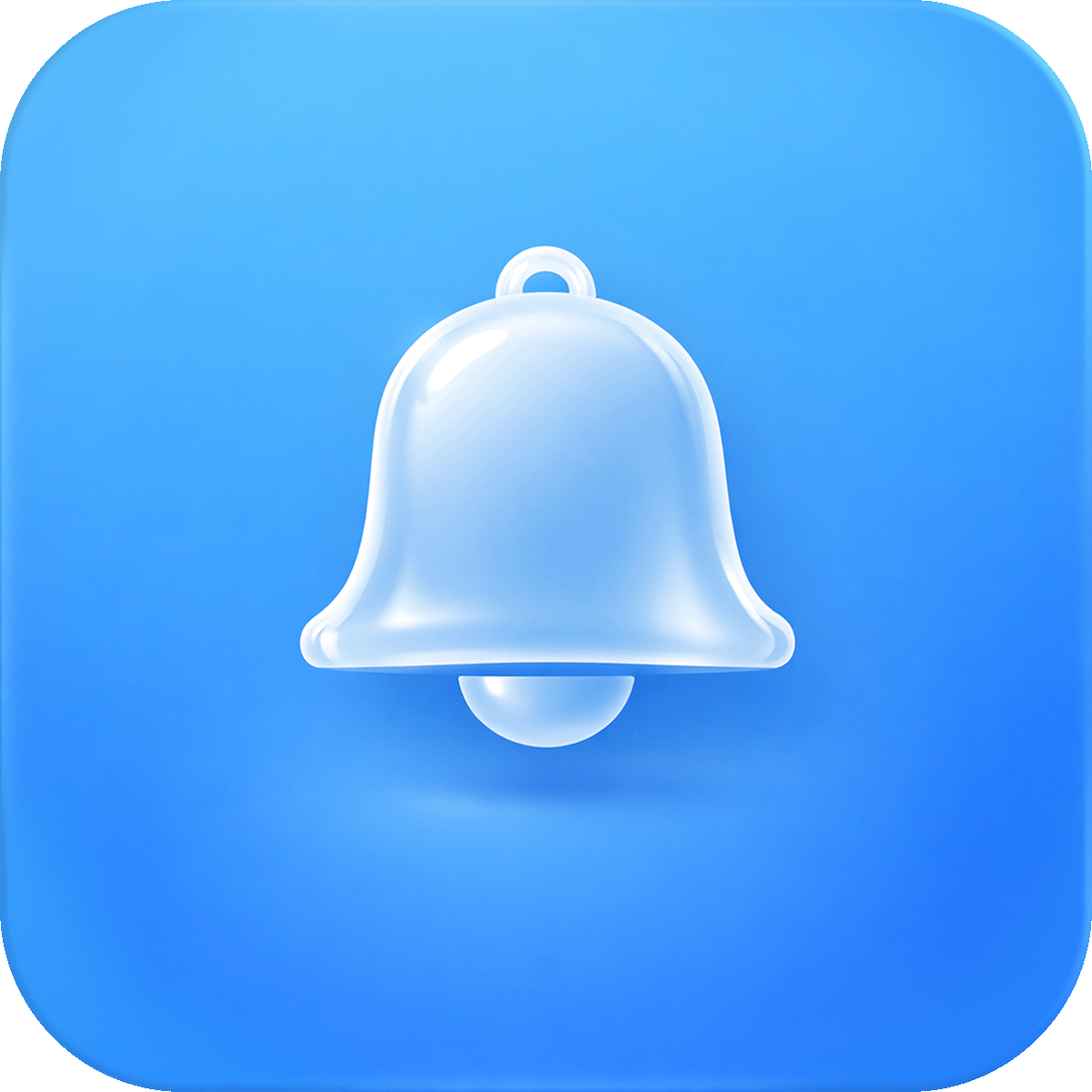
Bubble
The Bubble type creates a floating icon button in the corner of your store. When a visitor clicks the icon, a panel slides open to reveal your notification content.
Best For
- Ongoing promotions that visitors can check at their own pace
- Welcome messages that greet shoppers without interrupting them
- Support information like shipping details or return policies
- Subtle engagement that doesn't disrupt the browsing experience
How It Behaves
- A circular button with your chosen icon appears in the bottom corner of the page
- Clicking the button opens a panel with your title, content, and optional call to action button
- Visitors can close the panel and reopen it anytime by clicking the icon again
- Closing the panel does not dismiss the bubble — it stays visible as a button
- Optional pill badge (like "New" or "Sale") can appear on the bubble to grab attention
Unique Settings
- Icon selection — choose from 8 icons (Alert, Bell, Chat, Info, Megaphone, Star, Heart, Gift)
- Start Open — automatically expand the panel when the page loads
- Auto open once — if Start Open is enabled, only auto expand on the first page view
- Pill text — add a small colored badge label on the bubble
Text Box
The Text Box type creates a modal that appears directly on the page as soon as it loads (or after a set duration). Visitors see your message without needing to click anything.
Best For
- Urgent announcements like store closures or policy changes
- Limited time offers that need immediate visibility
- Important updates such as shipping delays or new product launches
- High priority messages that every visitor should see
How It Behaves
- The notification appears as a centered box overlaying the page content
- Visitors must actively close it by clicking the close button
- Once closed, the notification can optionally stay hidden for the rest of the browser session (via the "Stay hidden after close" setting)
Unique Settings
- Stay hidden after close — prevents the notification from reappearing after a visitor closes it during their session
Quick Comparison
| Feature | Bubble | Text Box |
|---|---|---|
| Appears automatically | Optional (Start Open) | Yes |
| Requires visitor click to see | Yes (unless Start Open) | No |
| Floating icon button | Yes | No |
| Can be reopened after closing | Yes | Only if not dismissed |
| Pill badge support | Yes | No |
| Best for | Subtle, ongoing messages | Urgent, must see messages |
Tips for Choosing
- When in doubt, start with a Bubble — it's less intrusive and visitors can engage on their own terms
- Use Text Box sparingly — overusing modal popups can frustrate visitors
- Consider running a Bubble for your general promotion and switching to Text Box only for time sensitive announcements
- You can have both types active at the same time (on different pages) using page targeting